Components
Buttons
Buttons
Buttons are entities that execute an action. In the context of the entellitrak design guidelines, there are four button action types.
Examples
Default Styles
Primary Button
- Font: Roboto
- Font Size: .85rem
- Font Weight: 400
- Line Height: inherited
- Text Color: --main-button-font-primary: #ffffff;
- Background Color: --main-color-blue: #1974c7;
- Height: 36px
- Width: auto
- Text Alignment: center
- Vertical Alignment: middle
- Display Mode: inline-flex
- Padding Top: 0px
- Padding Right: 20px
- Padding Bottom: 0px
- Padding Left: 20px
- Margin Top: none
- Margin Right: none
- Margin Bottom: none
- Margin Left: none
- Border: none
- Border Radius: 2px
- Border Color: none
- Cursor: pointer
- White Space: nowrap
- Position: relative
- Overflow: hidden
- Transition: all .2s ease-in-out
Variations
Supporting
- Text Color: --main-font-primary: #3a3a3a;
- Background Color: --main-color-gray-light: #1974c7;
Dismissal
- Text Color: --main-color-blue: #1974c7;
- Background Color: --main-color-white: #ffffff;
- Padding Top: 0px
- Padding Right: 10px
- Padding Bottom: 0px
- Padding Left: 5px
- Margin Left: 5px
Destructive
- Text Color: --main-font-primary-reverse: #ffffff;
- Background Color: --main-color-red: #d20000;
States
Hover
- Background Color: #1d4f91
Hover: Supporting
- Background Color: --main-color-gray: #d6d6d6;
Hover: Dismissal
- Text Color: #272727
- Background Color: transparent
Hover: Destructive
- Background Color: --main-color-red-dark: #a20000;
HTML
Notes
Action Types
- Smart Actions (smart/quick/workflow)
Comprise any interaction that executes a series of actions based on business rules. Examples: “Set assignee”, “Save and move to next record”
- Standard Actions (manipulate)
Comprise any interaction that edits and saves data on the current object. Examples: “Save / Cancel / Delete”
- Load Actions
These actions comprise of any interaction that generates a “load”. Examples: “+ New”, opening a modal window, “bookmark” buttons
- Organizational Actions
Comprise any interaction that changes the view or options of a list of records. Examples: “filter, vertical list vs. individual item toggler”
Button Types
Action Types
- Smart Actions (smart/quick/workflow)
Comprise any interaction that executes a series of actions based on business rules. Examples: “Set assignee”, “Save and move to next record” - Standard Actions (manipulate)
Comprise any interaction that edits and saves data on the current object. Examples: “Save / Cancel / Delete” - Load Actions
These actions comprise of any interaction that generates a “load”. Examples: “+ New”, opening a modal window, “bookmark” buttons - Organizational Actions
Comprise any interaction that changes the view or options of a list of records. Examples: “filter, vertical list vs. individual item toggler”
Button Types
The primary function of a button determines its look and placement within contexts. There are four button types, which can be of any action type.
- Primary Button (single)
- Supporting Buttons (Multiple)
- Dismissal (Multiple)
- Destructive (single)
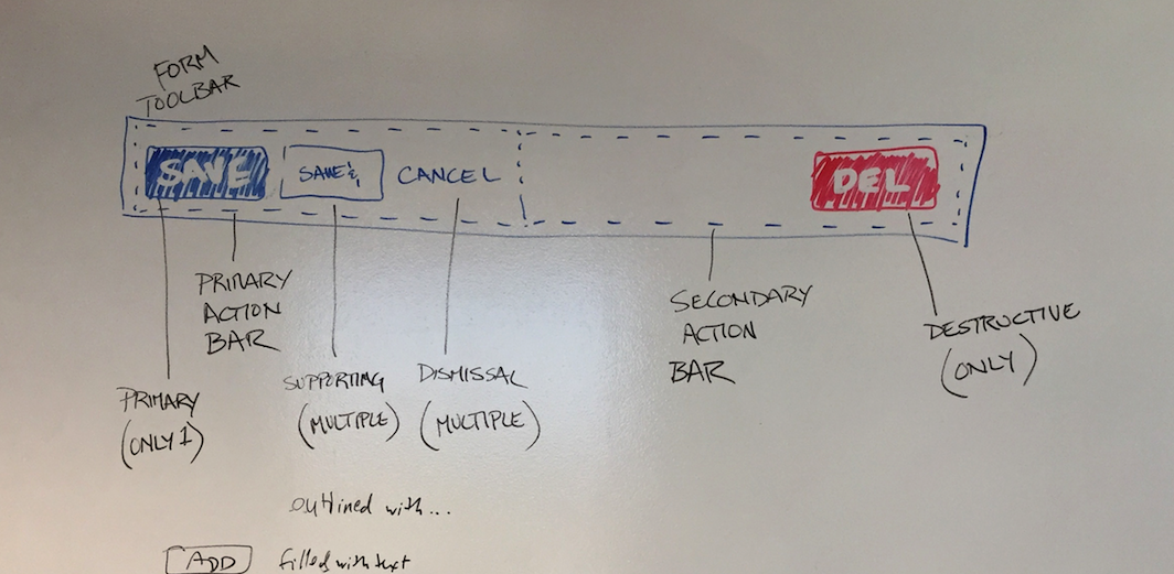
Button Groups
Buttons are grouped by function within primary and secondary action bars.
Typically, a primary action, supporting actions, and a single dismissal button will comprise a primary action bar. A destructive button is typically in a secondary action bar.
Action Bars with Buttons
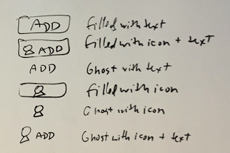
Button Style Options
Potential Types
Anatomy of a button
- Button
- Hint
- Icon
- Dropdown
- Content
Potential Types
Anatomy of a button
- Button
- Hint
- Icon
- Dropdown
- Content